Walkthrough

The purpose of this dashboard project is to uncover patterns, popular topics, and article types that resonate most with technical audiences.

This is especially useful for technical writers, for example, let's say you have a topic in mind that you want to write about, you probably have a few questions in mind, such as, "Is this topic already widely covered?", "Are audiences more into project based tutorial or do they want more educational content on this topic?", "I know a lot about Topic A, what are some subtopics in Topic A that hasn't been covered yet?"

In this walkthrough, I cover what each visualization is trying to communicate and how it could help technical writers understand the tech landscape and trends better. The examples I used in this walkthrough utilize static images for better explanation. To use the dynamic dashboard and get the latest results, go back to the dashboard or text mining page.


Exploratory Data Analysis (EDA)

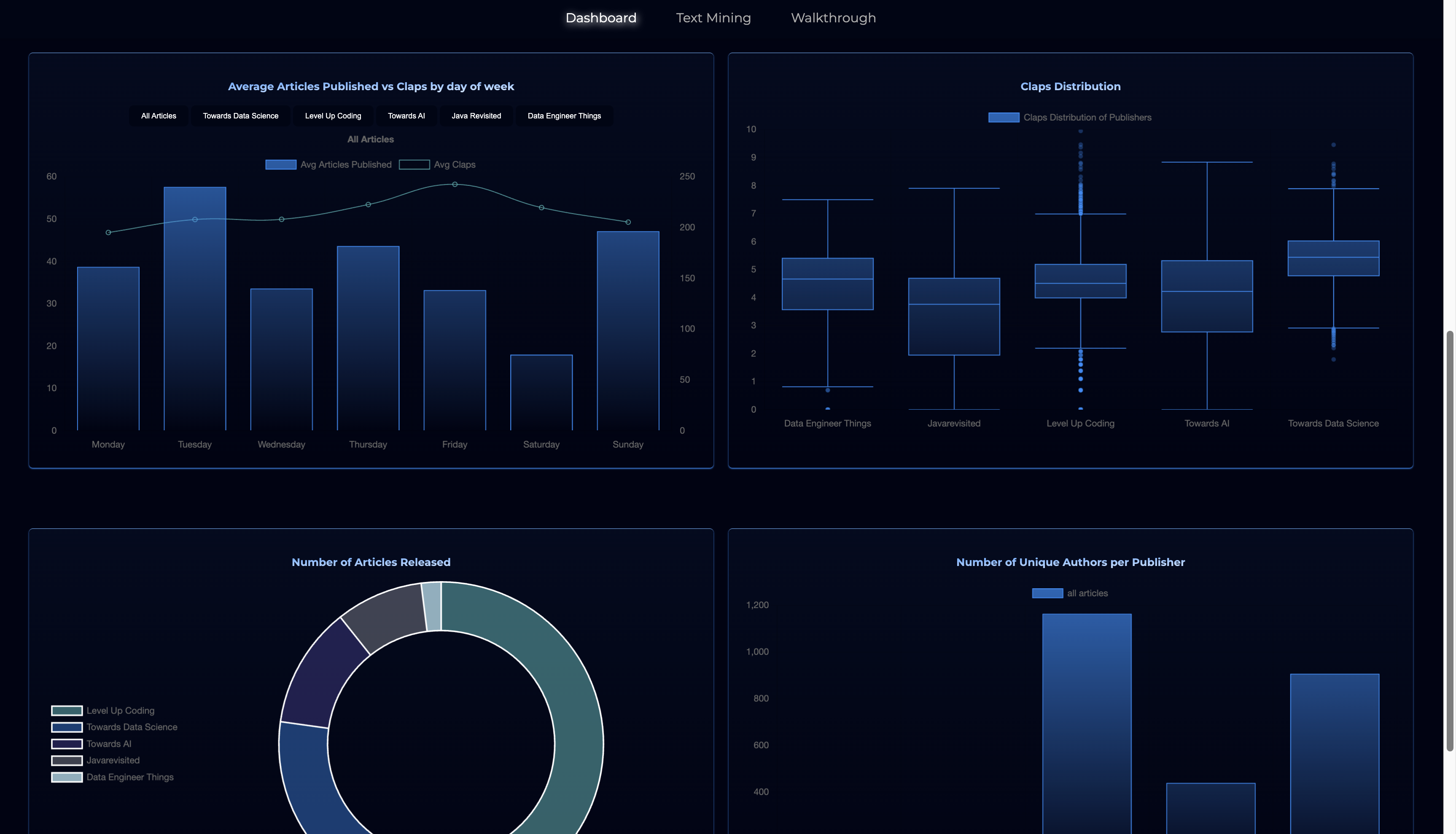
EDA Screenshot from Dashboard
EDA

The purpose of an EDA here is to uncover patterns and trends, providing insights into article performance, audience engagement, and forming initial hypotheses while laying the groundwork for deeper analysis.

Articles published vs claps received over time: Check how articles perform over time, can be filtered by publisher, for example, let's say a publisher published a lot of articles but received very little engagement during the same time period, that may indicate that the publisher tend to either offer lower quality content or readers that are less engaged.

Average articles published vs claps by day of week: With this, you can compare the days publishers are most active and when their articles are performing better, for example, if Publisher A tend to publish the most on Tuesday but engagement is highest for articles published on Friday, this may mean that readers tend to be more active on the weekend.

Claps distribution: We can also look at the claps distribution for each publisher to see where the median engagement numbers are, are there a lot of outliers? or mostly evenly distributed?

Number of articles released: If you compare the numbers here with the claps distribution above and see that a lot of articles are published but their claps distribution is on the lower end, this could indicate lower quality content are being accepted and published, or maybe people are not interested in the topics they are covering.

Number of unique authors per publisher: Higher number of unique authors may indicate more diverse point of view, if we again compare this to other data point, such as, claps distribution, does higher number of unique authors indicate higher engagement?
N-Gram Guide

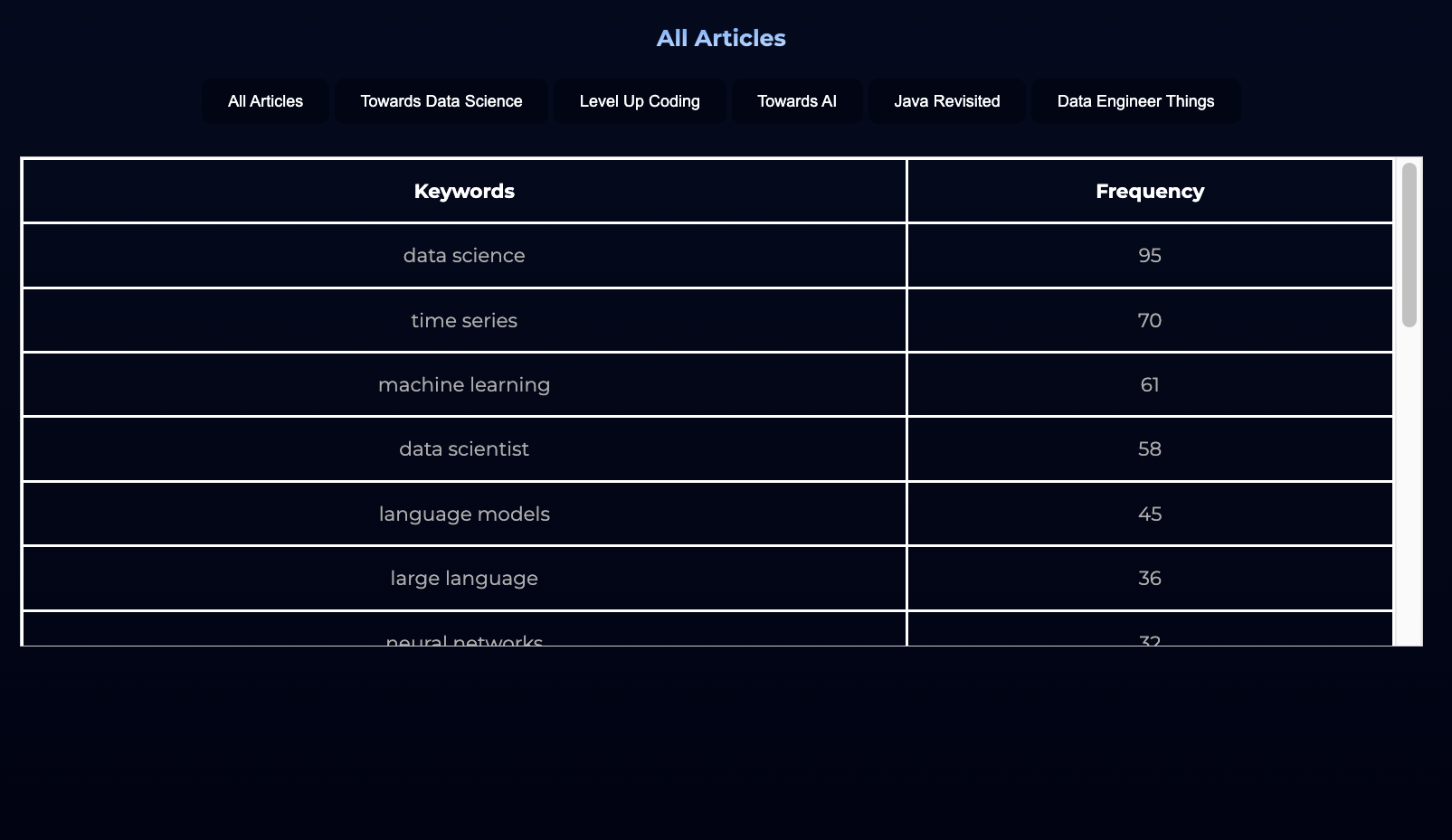
Bigram for all articles

bigram all articles

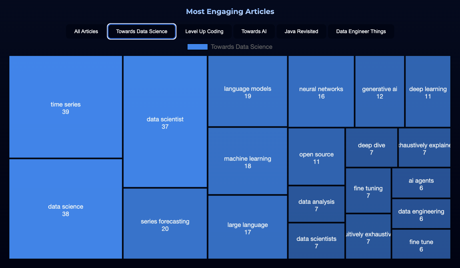
Bigram for articles with higher engagement

bigram for articles with higher engagement

Comments

In this section, I will provide quick walkthrough for n-gram using examples. The two screenshots above shows the bigram (two words) results, the left shows a table for the publisher 'Towards Data Science', while the right screenshot shows a treemap for the same publisher filtered with higher engagement result.

If you compare the result from the table vs the treemap, you will see that there are similarities, but notice how some keywords in the table are not shown in the treemap and vice versa. The keywords in the table represents the trend among writers, while the keywords in the treemap represents the trend among audience. In this example, the treemap shows keywords such as "ai agents", "intuitively exhaustively", and "exhaustively explained", which is not shown in the table. This indicates that readers are interested in the topic for "ai agents" and maybe prefer articles that are "exhaustively explained" or more in-depth, writers knowledgeable about the topic may want to write more in-depth article about this topic.


LDA Topic Modelling Guide

LDA for all articles

LDA

LDA for articles with higher engagement

LDA Above Average

Comments

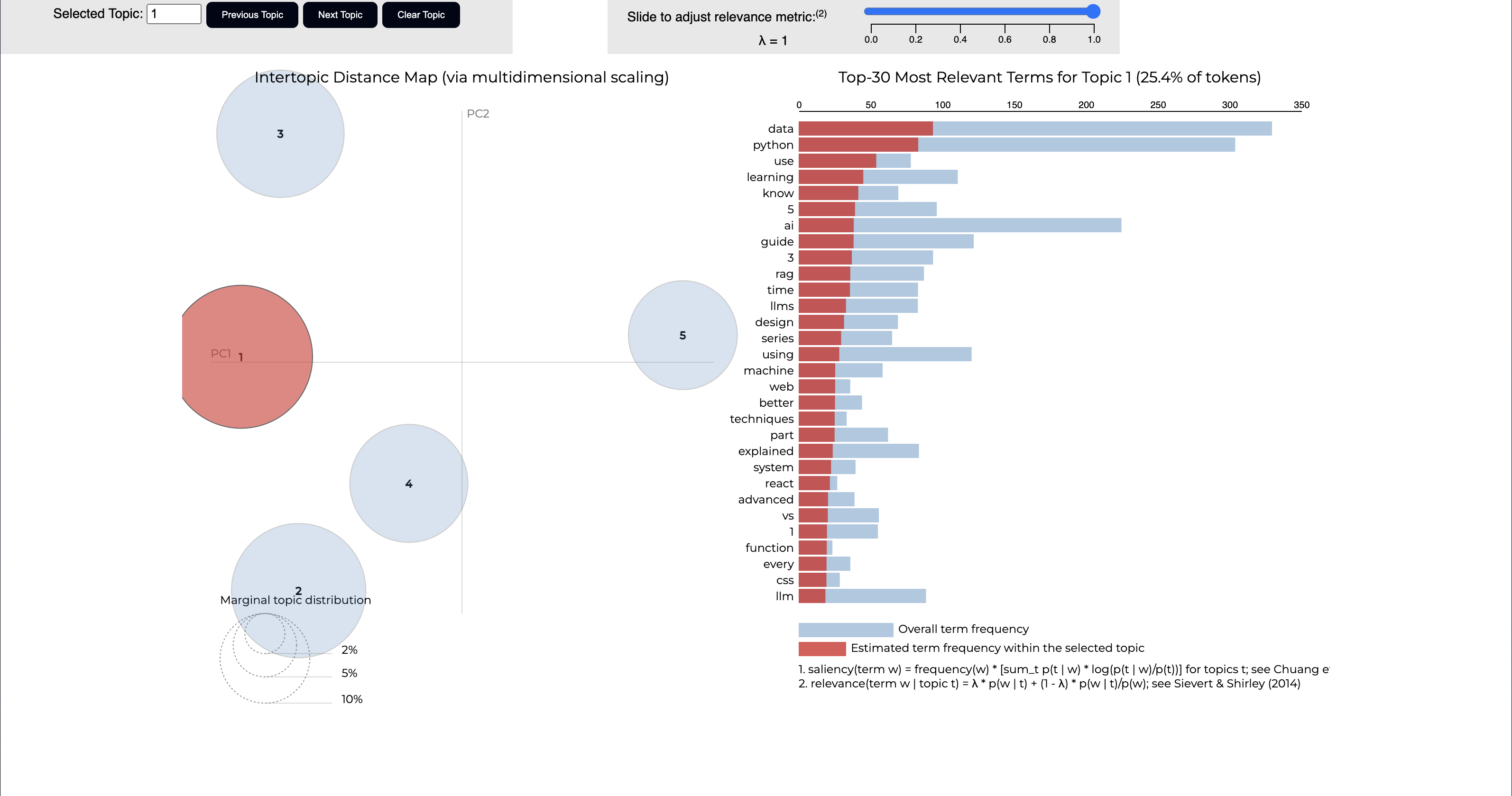
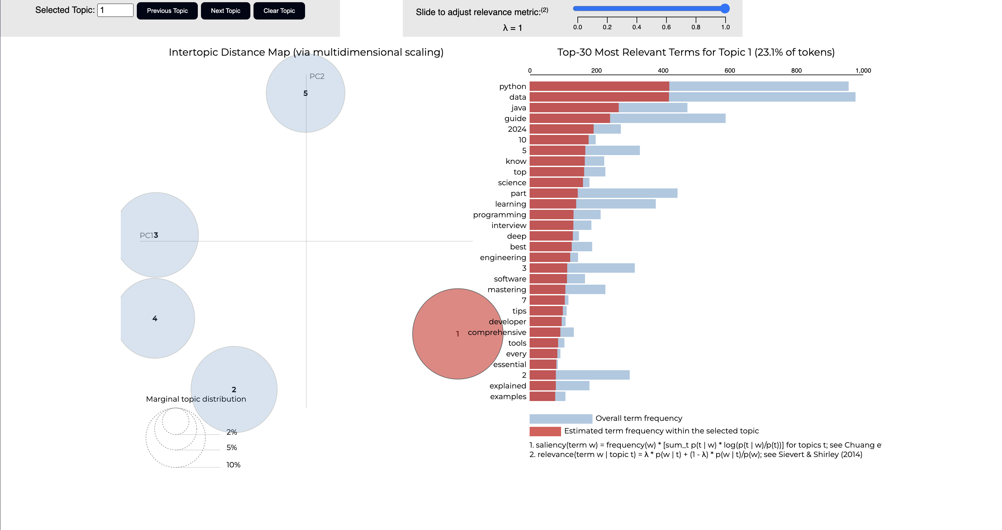
Take a look at the charts on the left above for LDA for all articles vs the one on the right for articles with higher engagement. The bubble chart on the left side of each image represents the top 5 identified topics from each image. When you click on any topic, it will show the most relevant terms for each topic.

Let's compare the top terms for topic 1 from each image, the image on the left will show topic and terms for all articles, and the image on the right will show topics and terms for articles with higher engagement Let's start with topic 1 for all articles, terms are mostly focused on programming skills and software engineering concepts, with more educational focus such as "guide", "tips" and emphasis on general knowledge such as "essential", "explained", and "interview". Now, take a look at topic 1 for articles with higher engagement, some similarities do occur, but the emphasis is more on specific topics, for example, "ai", "llms", "machine", "learning", and "rag". The topic also has fewer terms related to general education or instructional content compared to the previous topic, for example, "advanced", "system", "design".

The topic for all articles represents articles that are most often written, and the topic for higher engagement articles represents article that readers tend to engage more with. Clicking on the publisher button would show the result for each publisher and more focused results.